WhatsApp statistics (1)
 2023-11-19 - No comments
Back a few years ago, I got bored during Covid and realized it could be entertaining to get statistics out of a WhatsApp group. So things started with a bash script using sed, grep and wc, to count messages and occurrences of some words.
It looked like some people in that group had habits of texting during long meetings at work or just before lunch, and that some others seem to swear a lot. Running the log through a script can't lie.
After that, someone else mentioned the Pandas library for Python, that it can be handy to manipulate big amounts of data without iterating through like it's usually done with arrays and dictionaries. They also mentioned a couple of killer-features like loading/saving CSV files in one line, being able to manipulate timestamps, or being able to plot its dataframes in a single-line using Matplotlib. So why not rewrite that script from scratch using Pandas?
Reading log files
First, we need to look at the file saved by Whatsapp. It's 8845 lines long, humans can't process that easily, but the first lines give a good idea of the syntax and pattern:
01/02/2018, 12:34 - Messages and calls are end-to-end encrypted. No one outside of this chat, not even WhatsApp, can read or listen to them. Tap to learn more.
01/02/2018, 12:34 - ABC created group "XYZ"
01/02/2018, 12:34 - ABC added you
01/02/2018, 12:34 - ABC: <Media omitted>
01/02/2018, 12:34 - ABC: First blood!
01/02/2018, 12:35 - ABC: I dont have DEF's number
How convenient, the 6 first lines show all we need in order to understand the syntax:
DD/MM/YYYY, HH:MM - Name: Message content
We can ignore any line not following this pattern since people being added, leaving, or changing phone numbers don't bring any relevant information.
It seems that the way timestamps are recorded in the logs differ depending on the locales used by the phone. In this case, they are set to English/Germany.
Now we roughly understand how messages are sorted, we can read the file and format it in an usable way.
#!/usr/bin/env python
# -*- coding: utf-8 -*-
import pandas as pd
import re
FILE = './WhatsApp Chat with XYZ.txt'

def read_file(filename):
	# basic text file read
	f = open(filename, 'r')
	text = f.read()
	f.close()

	# Regex to account for messages taking up multiple lines and multiple posts
	pattern = re.compile(r'^(\d\d\/\d\d\/\d\d\d\d.*?)(?=^^\d\d\/\d\d\/\d\d\d\d|\Z)', re.S | re.M)

	# Sort everything by timestamp, sender and message
	timestamp = []
	sender = []
	message = []
	data = [m.group(1).strip().replace('\n', ' ') for m in pattern.finditer(text)]
	# replace image string to make it easier to sort
	data = [line.replace('<Media omitted>', '<Media_omitted>') for line in data]
	# replace multiple ? or ! to make them easier to count
	data = [re.sub(r'[\?\.\!]+(?=[\?\.\!])', '', line) for line in data]

	for row in data:
		# timestamp is before the first dash
		timestamp.append(row.split(' - ')[0])
		# sender is between dash and colon
		try:
			s = re.search('\ - (.*?):', row).group(1)
			sender.append(s)
		except:
			sender.append('')
		# message content is after the first colon
		try:
			message.append(row.split(': ', 1)[1])
		except:
			message.append('')
	# concatenating all three string arrays into a Pandas DataFrame
	df = pd.DataFrame(zip(timestamp, sender, message), columns=['timestamp', 'sender', 'message'])
	# converts timestamp string into a timestamp object
	df['timestamp'] = pd.to_datetime(df.timestamp, format='%d/%m/%Y, %H:%M')

	# removes events not associated with a sender
	df = df[df.sender != ''].reset_index(drop=True)
	return df

if __name__ == "__main__":
	df = read_file(FILE)
	print df
The result matches exactly the beginning of the file we fed to the script:
    timestamp              sender    message
0   2018-02-01 12:34:00    ABC       <Media_omitted>
1   2018-02-01 12:34:00    ABC       First blood!
2   2018-02-01 12:35:00    ABC       I dont have DEF's number
[8325 rows x 3 columns]
The first thing to see is that the number of rows doesn't match the number of lines of the text file, since lines corresponding to events rather than messages have been dropped.Now we have our data in an usable format, so let's continue playing by extracting data.
Basic data extraction
What data can be useful at this stage?
- date and time
- Number of messages, but this can be misleading since message length seems to vary
- Number of words, seems to be a more realistic index
- Number of messages containing question marks, exclamation marks, links or images, to give a rough idea of the content of the messages
- Number of words by message, to check if the number of messages and number of words correlate
Here's how the corresponding code looks like:
def expand_frame(df):
	# number of messages vs time (absolute date)
	df['date'] = pd.to_datetime(df['timestamp']).dt.strftime('%Y-%m-%d')
	# number of messages vs day of the week
	df['DoW'] = pd.to_datetime(df['timestamp']).dt.day_name()
	# number of messages vs time of the day, hh:mm and hour
	df['time'] = pd.to_datetime(df['timestamp']).dt.time
	df['timeh'] = pd.to_datetime(df['timestamp']).dt.hour
	# flag a message that contains images, exclamation/question marks or links
	df['q'] = df['message'].str.count('\?')
	df['x'] = df['message'].str.count('!')
	df['link'] = df['message'].str.contains('http')
	df['img'] = df['message'] == '<Media_omitted>'
	# count words for each message
	df['wordcount'] = df.message.apply(lambda x: len(x.split()))

	return df
It seems to be doing the things we want:
               timestamp  sender                        message
0    2018-02-01 12:34:00    ABC                         <Media_omitted>
1    2018-02-01 12:34:00    ABC                         First blood!
2    2018-02-01 12:35:00    ABC                         I dont have DEF's number
[8325 rows x 12 columns]
timestamp sender message date DoW time timeh q x link img wordcount
0 2018-02-01 12:34:00 ABC
1 2018-02-01 12:34:00 ABC First blood! 2018-02-01 Friday 12:34:00 12 0 1 0 0 2
2 2018-02-01 12:35:00 ABC I dont have DEF's number 2018-02-01 Friday 12:34:00 12 0 0 0 0 5
[8325 rows x 12 columns]
[/code] We'll come back to it later when we need more data to process.
Sorting data
The next step is to analyze the data and put it into human-readable formats.
We'll start to group this data by sender and by day of the week
DOW = [ 'Monday', 'Tuesday', 'Wednesday', 'Thursday', 'Friday', 'Saturday', 'Sunday']
DOW2 = [ 'Mon', 'Tue', 'Wed', 'Thu', 'Fri', 'Sat', 'Sun']
def sort_frames(df):
	# data by sender
	dfsender = pd.DataFrame(zip(
		sorted(df.groupby(['sender'])['sender'].indices.keys()), # list of senders (groupby sorts by alphabetic order)
		df.groupby(['sender'])['message'].count(), # counts number of messages by sender
		df.groupby(['sender'])['img'].sum(), # counts number of images by sender
		df.groupby(['sender'])['q'].sum(),
		df.groupby(['sender'])['x'].sum(),
		df.groupby(['sender'])['link'].sum(),
		df.groupby(['sender'])['wordcount'].sum() # number of words by sender
		),
		columns = ['sender', 'messagecount', 'img', 'q', 'x', 'link', 'wordcount']
	)
	# computes average message length
	dfsender['length'] = dfsender['wordcount'] / dfsender['messagecount']

	# data vs timestamp
	dfdate = pd.DataFrame(zip(
		sorted(df.groupby(['date'])['date'].indices.keys()),
		df.groupby(['date'])['message'].count(),
		df.groupby(['date'])['img'].sum(),
		df.groupby(['date'])['q'].sum(),
		df.groupby(['date'])['x'].sum(),
		df.groupby(['date'])['link'].sum(),
		df.groupby(['date'])['wordcount'].sum()
		),
		columns=['date', 'messagecount', 'img', 'q', 'x', 'link', 'wordcount'],
	)
	dfdate['length'] = dfdate['wordcount'] / dfdate['messagecount']

	# filling gaps in index
	dfdate['date'] = pd.to_datetime(dfdate['date'])
	dfdate.set_index('date', inplace=True)
	dfdate = dfdate.resample('1D').mean()
	dfdate.reset_index(inplace=True)
	dfdate.fillna(0, inplace=True)

	return dfsender, dfdate
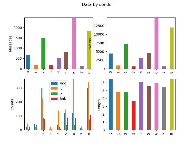
This way we can display the results:
   sender  messagecount    img    q   x   link  wordcount    length
0   AAAAA           681   20.0   45   3   24.0       4401  6.462555
1    BBBB           194   40.0   19  35    2.0        937  4.829897
2    CCCC          1489  297.0  224  86   78.0       7240  4.862324
3    DDDD           179    3.0   22   3    0.0        658  3.675978
4  EEEEEE           512   38.0  139  21    8.0       3119  6.091797
5    FFFF           803  121.0  146  33   88.0       4472  5.569116
6   GGGGG          2491  119.0  365  39   83.0      14876  5.971899
7  HHHHHH           131   12.0   25   4    2.0        720  5.496183
8  IIIIII          1845  300.0  341  74  106.0      11975  6.490515

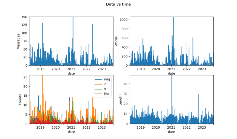
            messagecount  img     q    x  link  wordcount    length
date
2018-02-01           4.0  1.0   0.0  1.0   0.0       26.0  6.500000
2018-02-02          10.0  0.0   3.0  0.0   0.0       80.0  8.000000
2018-02-03           5.0  2.0   1.0  0.0   0.0       25.0  5.000000
2018-02-04           0.0  0.0   0.0  0.0   0.0        0.0  0.000000
Plotting data
This is not very convenient to read, we can plot it instead.
import matplotlib.pyplot as plt
plt.rcParams["figure.figsize"] = [10.24, 6] # sets plots resolution to 1024*600px

def subplotr(df, axes, index=0):
	if(len(df) < 30): # avoids too dense bar plots
		plkind='bar'
	else:
		plkind='line'
	if(index == 0):
		pass
	else:  #selects X axis
		df.set_index(index, inplace=True)
	df['messagecount'].plot(ax=axes[0, 0], kind=plkind, label='messages')
	df['wordcount'].plot(ax=axes[0, 1], kind=plkind, label='words')
	df[['img', 'q', 'x', 'link']].plot(ax=axes[1, 0], kind=plkind)
	df['length'].plot(ax=axes[1, 1], kind=plkind, label='length')
	axes[0, 0].set_ylabel('Messages')
	axes[0, 1].set_ylabel('Words')
	axes[1, 0].set_ylabel('Counts')
	axes[1, 1].set_ylabel('Length')
	for i in range(2):
		for j in range(2):
			axes[i, j].margins(0)

def generate_plots():
	#fig1 - everything by sender
	fig1, axes1 = plt.subplots(2, 2)
	fig1.suptitle('Data by sender')
	subplotr(dfsender, axes1, 'sender')
	# ...
	#fig3 - everything vs time
	fig3, axes3 = plt.subplots(2, 2)
	fig3.suptitle('Data vs time')
	subplotr(dfdate, axes3, 'date')

plt.show()


It looks usable, but we can still do better.
Basic statstics
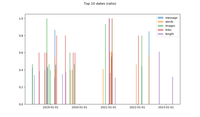
We can actually extract the peaks and plot them:
def top(dfdate):
	## top 10
	dfdate.set_index('date', inplace=True)
	dftop = pd.concat( # normalized data
		[dfdate.sort_values('messagecount', ascending=False).groupby('date')['messagecount'].head()[:10] / dfdate.sort_values('messagecount', ascending=False).groupby('date')['messagecount'].head()[0],
		dfdate.sort_values('wordcount', ascending=False).groupby('date')['wordcount'].head()[:10] / dfdate.sort_values('wordcount', ascending=False).groupby('date')['wordcount'].head()[0],
		dfdate.sort_values('img', ascending=False).groupby('date')['img'].head()[:10] / dfdate.sort_values('img', ascending=False).groupby('date')['img'].head()[0],
		dfdate.sort_values('link', ascending=False).groupby('date')['link'].head()[:10] / dfdate.sort_values('link', ascending=False).groupby('date')['link'].head()[0],
		dfdate.sort_values('length', ascending=False).groupby('date')['length'].head()[:10] / dfdate.sort_values('length', ascending=False).groupby('date')['length'].head()[0],
		], sort=True, axis=1)
	dfdate.reset_index(inplace=True)
	dftop.fillna(0, inplace=True)
	return dftop

def generate_plots():
	# ...
	#fig 10 - Top 10 plots
	fig10, axes10 = plt.subplots()
	axes10.xaxis.set_major_formatter(mdates.DateFormatter('%Y-%m-%d'))
	axes10.bar(dftop.index, dftop['messagecount'], label='message', width=10, alpha=0.5)
	axes10.bar(dftop.index, dftop['wordcount'], label='words', width=10, alpha=0.5)
	axes10.bar(dftop.index, dftop['img'], label='images', width=10, alpha=0.5)
	axes10.bar(dftop.index, dftop['link'], label='links', width=10, alpha=0.5)
	axes10.bar(dftop.index, dftop['length'], label='length', width=10, alpha=0.5)
	axes10.legend()
	fig10.suptitle('Top 10 dates (normalized)')
We generate a DataFrame containing all the top ten values from each field, divided by its maximum value to make them readable on the same Y-axis. An alternative would be to use a log scale on the Y-axis.
At this point, we start to have a lots of plots to display, and plt.show() starts making a mess by opening too many windows.
We can comment plt.show() and replace it by the following line, duplicated for each figure we want:
fig10.savefig('Figure_10.png')
This way plots are silently exported to files.
Understanding data
The interesting thing about the plots showing data over time is to look at the log around the dates showing-up to see what happened.
- November 2018, peak number of images, discussing and exchanging memes
- Februrary 2019, unofficial ski event, log also shows lots of questions similar to: "I'm here, where are you guys?"
- 2020, Covid and lockdowns, low activity
- February 2021, something major happened to the company
- May 2022, someone mentioned he might leave the team
Going further
The code took roughly one rainy weekend to get to the state where things were working well enough to get usable data, and a few weeks to improve the code based on Pandas' learning curve.
It's a good start to play with Pandas, but we can do more.
Notes and references
- Names and dates have been changed to make the data anonymous.
- Blog from someone who had the same idea
- Python Data Science Handbook, Jake VanderPlas
- Pandas userguide